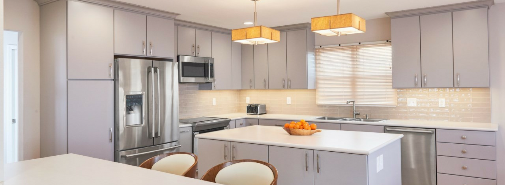
Large Kitchen Remodel with a St. Louis Skyline View

Project Summary: Large Kitchen Remodel with a St. Louis Skyline View
An amazing view of the Mississippi River and the downtown St. Louis skyline was what attracted this family to the home. However, it was not their style and the view was not visible in the most important room of the house, the kitchen.
We worked with the homeowners to redesign the kitchen so that it was open to the living area and provided a visual extension of their outdoor space.
The Vision
Using sustainable products and creating open sightlines were the main goals of the project. We also strived for a space that reflected the family’s sleek aesthetic and busy lifestyle.
Contemporary finishes and lighter colors were to be used throughout the space to better match the family’s tastes. It was important to this family to include sustainable choices, and we incorporated as many as possible. Several finishes carried into other rooms on the first floor to maintain a continuous flow.
The Challenge
Like any remodeling project, this one had its fair share of obstacles. A little planning ahead of time ensured that the process was stress-free for the homeowners.
The kitchen project was invasive and spilled into other parts of the home. To be efficient with time and resources, flooring and electrical work on the first floor were scheduled to occur at the same time. As the family remained in the home during the work, several important steps were taken to make sure they could exist comfortably while the remodel occurred.
We set up a temporary kitchen on the lower level and blocked off the open stairwell with plastic walls to contain dust and debris. An air scrubber was used throughout the process to support the health and safety of the family and their pet.
The Details
The goal was to deliver a design that suited the family’s modern tastes, but it also had to be sustainable and eco-friendly.
The plan for the new kitchen opened it up and connected it to the living room, which in turn was open to the front entry and hallway.
To maintain a clean look, the same flooring would be used throughout most of the main floor. The homeowners had already researched some “green” flooring choices on their own, like bamboo and cork. They turned to us to help with the final decision. We all agreed that cork was the best choice. It is durable and forgivable – perfect for a large dog and growing child. The tongue-and-groove floating flooring featured waterproof joints, so it was even safe to install in the kitchen. The family felt good about their decision to use a fast-renewing resource like cork (as opposed to wood) to finish such a large surface in their home.
We were conscious of the desire to be green in all fixture and finish choices. The family’s love for modern style was never sacrificed in favor of responsible material choices. The result is a space that looks warm and sleek – and, it is friendly to the environment.
The Transformation
The original kitchen had five doorways and one large window. We began the kitchen remodel by removing two walls, which allowed natural light to flow from room to room. Doing so required recessing a beam into the attic before demolishing the wall between the two rooms; the second wall did not require structural changes. Once the walls were removed, the decision was then made to “flip” the rooms, as it was impossible to create a workable floorplan any other way in this historic Creve Coeur, MO home.
What was once the kitchen was remodeled to become the dining area. And the remaining walls in what was originally the dining room allowed us to create a smoother traffic pattern and gave us the area we needed for appliances and cabinetry. The user-friendly kitchen layout fits perfectly in the original dining room and flows nicely into the new one, as well as into the front playroom/living room. A less formal dining area translates to a more family-oriented open space, perfect for keeping an eye on young children while cooking.
BEFORE:
The existing island was not functional. The counter to the left of the refrigerator was rarely used for anything and usually gathered mail. Pink floors, outdated cabinets, and dark wall colors did not reflect the homeowners’ taste and style.
AFTER:
The new island is deeper and now has storage on both sides. The cabinet to the left of the refrigerator was replaced with a tall pantry cabinet. The barn door with frosted glass panels is shown closed but easily slides open for access. Outdated cabinets were replaced with contemporary slab-front painted cabinets that reach the ceiling. Crown molding provides more storage and makes the space feel taller and larger. The pendants over the island were updated with square grass-cloth fixtures that mimic the graining on the cork floors.
BEFORE:
A full-height wall separated the kitchen from the living room and blocked the amazing view from its large windows.
AFTER:
The enlarged opening connects the kitchen to the living room and the new continuous flooring makes the whole space feel larger.
