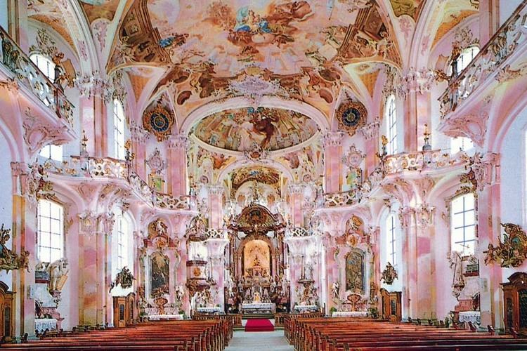
Traditional beauty embraces embellishment and ornamentation. Unlike more minimal design trends like transitional, modern, and contemporary, traditional doesn’t shy away from excess. And why should you? Minimalism isn’t for everyone. If you enjoy the look and feel of luxury, then traditional kitchen design may be just the thing for you.
Traditional design is inspired by just that… tradition. Taking stylistic cues from the 18th and 19th centuries, traditional design embodies the richness and opulence of Europe in its artistic heyday. Harmony, order, and symmetry abound. In a traditional space, design elements slot perfectly together like pieces of a puzzle, creating a cohesive final product.
A History of Design
Traditional design is inspired by English and French imperial styles. It’s only logical, then, that anything associated with these periods is regal and exquisitely furnished because, at the time, they were, in fact, made for royalty. Between the 1700s and 1800s, popular designs included Baroque and Rococo styles, which were both notorious for their extravagance and excess.
Baroque

Baroque isn’t just about interior design and architecture; it also includes the music of Vivaldi, Handel, and Bach, and artists such as Vermeer, Caravaggio, and Rembrandt. Catholics and Christians were particularly fond of mind-blowingly grand houses of worship, such as St. Paul’s Cathedral in England, the National Pantheon in Spain, and the Cathedral of San Nicolo in Italy. But perhaps the best-known example of Baroque architecture is the Palace of Versailles in France. Noticing a theme? The Baroque era was known for its flourishes, embellishment, and a brooding sense of drama. Some might describe it as pompous or stuffy, but we prefer the term “classical.”
Rococo

Rococo, also known as “late Baroque,” was similar, but perhaps even more frilly than its predecessor. Subsequently, it had a much shorter shelf life, as it was only popular between 1650 and 1790. If you’ve ever seen a highly ornate vintage mantel clock, you probably have a good idea of what Rococo architecture looks like. Imagine floral motifs, curlicues, curved lines, gold embellishment, and pastel colors. Now imagine them all together in one space—the Catherine Palace in Russia is a perfect example of this. It’s frankly not surprising that Rococo fell out of style by the late 18th century, later replaced by Neoclassical design.
Neoclassical

Unlike Baroque and Rococo, Neoclassical embraced a return to the Greek and Roman classics. It favored symmetry and lots of it. Clean lines and a more stripped-down style marked a return to simplicity and the ideal of democracy. Beauty was no longer just for the upper class!
Traditional design takes cues from all three of these eras. It gets its regality from Baroque, its love of excess from Rococo, and Neoclassical’s appreciation of symmetry. Bring them all together, and you have a design that works in even the most modern of homes!
Bringing the Past to the Present
While some homeowners find traditional design a touch staid, stuffy—boring, even—many others find comfort in its predictable and luxurious symmetry. Now how can you bring the traditions of the late, great design periods into your very own kitchen?
Dark Wood

Nothing says ‘brooding drama’ quite like the presence of dark, sleek, glossy wood. In traditional kitchens, this looks great on cabinets, both upper and lower. It can also look ultra-luxe on the floor, but remember that wood needs a little extra care and maintenance, especially if you’re expecting drops and spills.
Neutral Tones

For a traditional kitchen, let’s leave the pastels in the Rococo period. Traditional kitchens tend to stick to a more neutral color palette, veering away from anything excessively bold, stark, or attention-grabbing. Warm tones, such as browns, beiges, tans, and creams are the preferred color choices, more often than not.
Furniture Features

Traditional furnishings include classic concepts like wingback chairs, plush, overstuffed cushions, rolled arms, cabriole legs, claw feet, inlaid motifs, and studded backs.
We hope this little journey into the past has given you some ideas for your own traditional kitchen. If you’re still unsure, J.T. McDermott Remodeling can help. Our experts are as passionate about design as you are about your home. Let’s work together to create something incredible. Connect with us today, and let’s go there!
Key Details
Architectural components like wainscoting, crown moldings and columns make for a great traditional foundation. They’re accented perfectly with features like chandeliers—or an elegant light fixture if a chandelier is a little too much—gold embellishment, carved wood details, glossy stone, rich, heavy draperies, and luxurious fabrics like velvet, paisley, silk, and leather.
