Back To Life with a Whole House Renovation in St. Louis, MO

- Location: This home is located on Oakland Avenue in a small, tree-lined city in St. Louis with a history that dates to the early 1900s.
Project Summary: Back To Life with a Whole House Renovation
Our client purchased this home many years ago but only lived in it for a short time. Originally built in 1907, the house sat empty for the last 10 years and quickly deteriorated. The homeowner wanted to retire to this home but it required a great deal of work to repair damage from exposure and neglect.
To bring it back to life, we needed to tear an addition off the back of the house, enlarge the kitchen and install a full bath on the main floor to support aging-in-place.
The entire project took 18 weeks, start to finish, and included several projects throughout the house that were unrelated to the addition, such as removing the boiler system and overhauling the HVAC.
The Vision
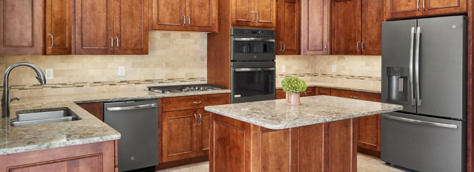
Enlarging the footprint of the addition allowed us to design a bathroom and kitchen that better suited the homeowner and her needs. She wanted a bright space looking out over the garden and a larger kitchen that would allow space for her visiting children to join her at the center island and bake during the holidays.
In respect to the aging-in-place dynamic, we needed to create space for a shower as well as a laundry area on the first floor. Enlarging the addition was the only way that was going to be possible. The bathroom was enlarged into the kitchen area and a laundry closet was built into the living area, doubling as a sort of natural divide between the new, larger kitchen and the living space.
The Challenge
To complete the project, the existing deck and a crumbling addition had to be removed. There was too much damage and wear on both to salvage anything whatsoever.
Where the new addition meets the original house was a key feature, both to the homeowner and the remodeling team. It was important to us to preserve the original details and beauty of this home, but it was also important—both to us and to the client—that the addition should not FEEL like an addition. We wanted the new space to blend seamlessly and comfortably with the original, so the original hardwood floors, French doors, pocket doors, and moldings were affected as little as possible.
Another challenge was that our client, a native of Brazil, is not completely fluent in English. For the most part, this was not an issue, but we did have to be careful to make sure she fully understood the terms we were using and knew what to expect in terms of the finished product. Selection sheets and decorator sheets helped the design team and the homeowner stay on track and remember what the final selections were during the long process of materials ordering and permitting.
The Details
First and foremost, we wanted to keep the history of the home prevalent in the design of the new space. To that end, clean, simple materials were chosen. Panel doors were painted white, white trim, bright walls, and flooring. The kitchen and bathroom materials feature earthy, neutral palettes to avoid casting a modern light on them. Cleanability was important, so we did not choose any porous or rough-textured materials.
The existing addition had several serious issues. Besides the damage it had sustained through its years of disuse, the structure was little more than brick pillars. The room had a radiator but, like the rest of the house, there was no air conditioning or overhead lighting.
The new room, in contrast, is open, bright, and clean. The drywall walls and high ceiling allowed for recessed can lights and a ceiling fan while keeping enough operable windows to appease the homeowner, who loves natural light and fresh air.
The original kitchen was tight and awkward. To remedy this, the kitchen was extended toward the back by 8.5 feet and the tiny powder room was enlarged to be a three-quarter bath. The new layout of the bathroom, kitchen, and living space allowed for a small closet where we installed a stacking washer and dryer.
A larger, operable window was installed overlooking the small deck and backyard, giving the homeowner a view of one of her favorite spaces. Natural colors and textures in the new selections lend a clean and welcoming feel that represents a big departure from the original.
